Imagine Mombi as Google’s counterpart in an alternate universe. We make an e-mail app, a calendar app, a maps application. We’re so ubiquitous that people often say things like, “I need to ask Mombi.” Our visual language is minimal and flexible. We prefer simple imagery over complex, and visual metaphor over literal messaging. Some of our products (like Mombi Cloud) are very complex, so we try to distill ideas down into the simplest form possible. This is a brand anthem piece, and it should have a sweeping, epic feel. We want the viewer to have a sense of hope and excitement at the end of the spot. We’re changing the world, and we’re proud to let everyone know it. This was a class assignment meant to mimic a real-world project. My first step was to analyze the brief and grasp the details. I focused on key words like, minimal, simple imagery, and visual metaphor, and my next step was to learn more about Mombi’s visual language, their brand, and what it takes to make a sweeping, epic piece that hits the mark.
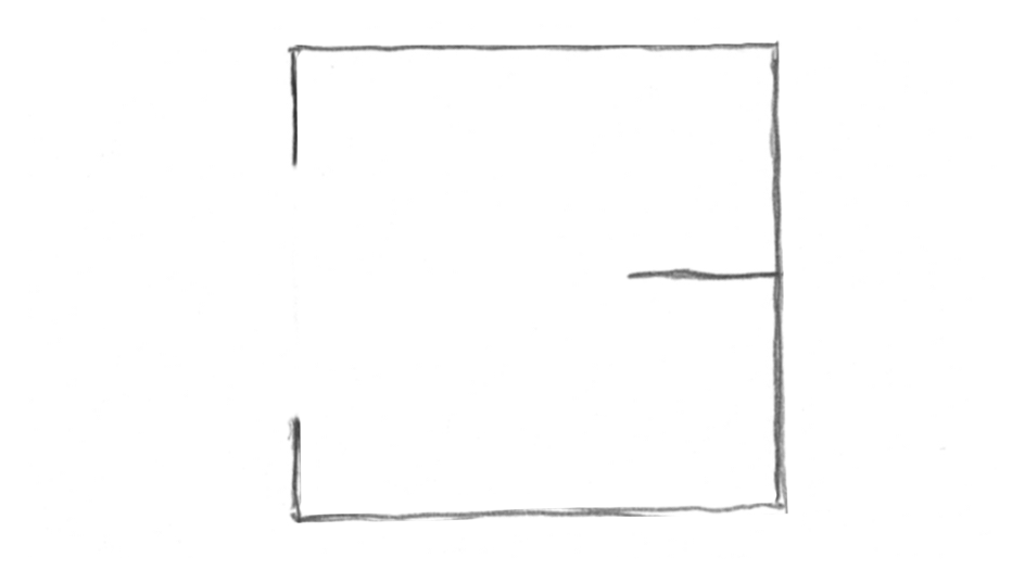
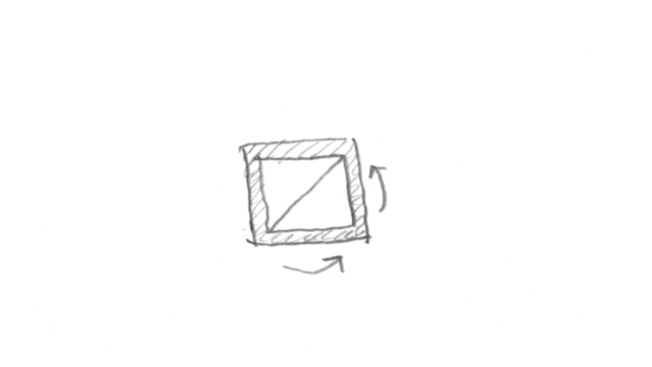
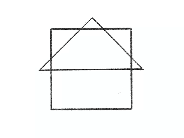
Mombi’s visual identity is minimal, and they prefer the simple over complex. I chose to focus on the square shape from their brand identity as a visual theme to meet that objective. Their motto is “Making the Miraculous Ordinary”, and the square shape is a great way to show how an ordinary shape can also be miraculous, just like their brand.
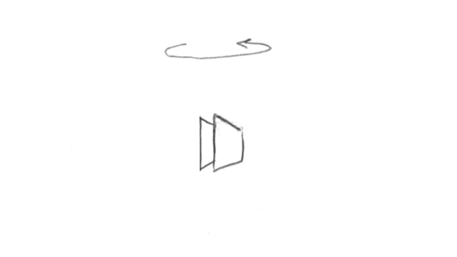
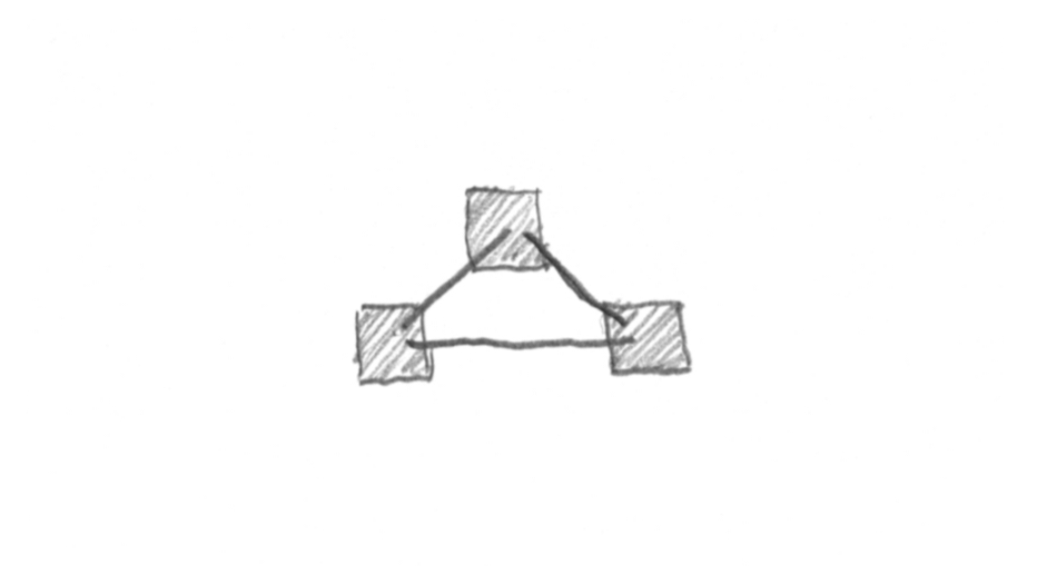
I explored metaphors to help visualize the script and bring the animation to life. It’s easy to think in scenes at this stage of the process, but I went back through to plan the motion, thinking of the animation as a whole. This helped me visualize the script as one story instead of various scenes.
When I had some doubts about whether a motion would look good, or even work in the piece, I would do short tests in Procreate. These are fun to do, and can help build confidence when you need to express to the client that yes, it will work.
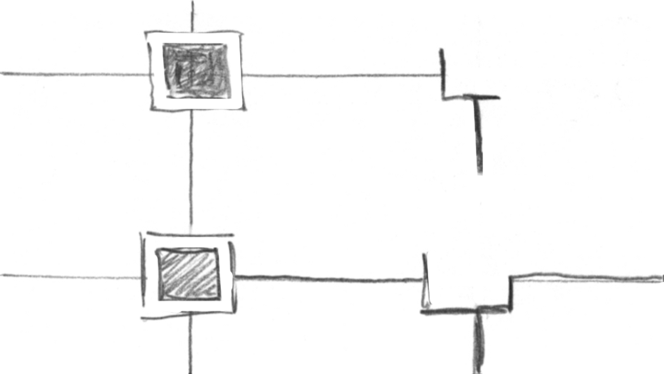
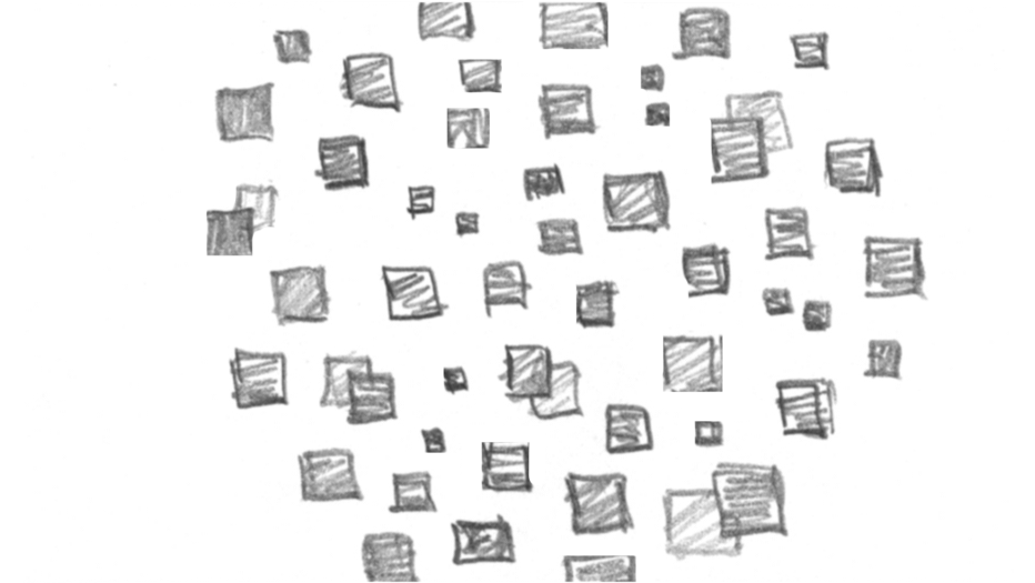
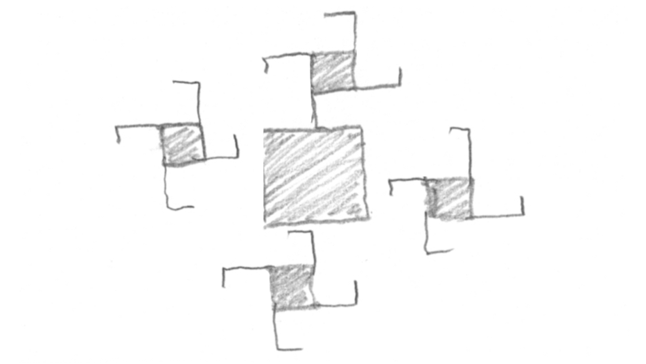
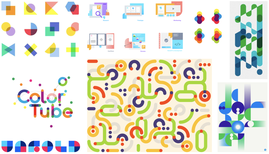
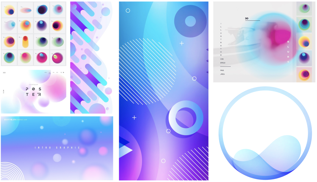
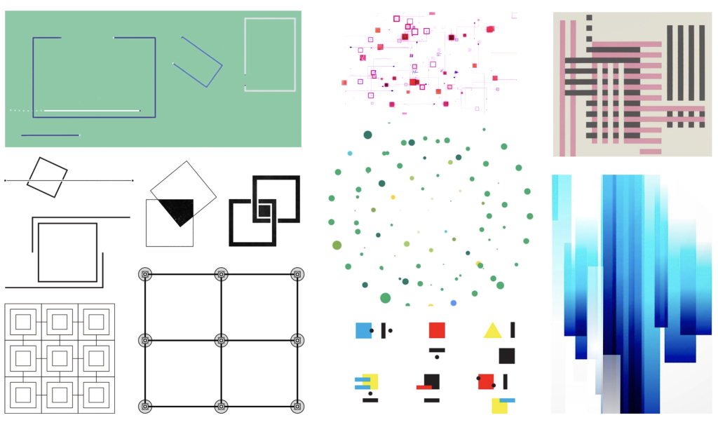
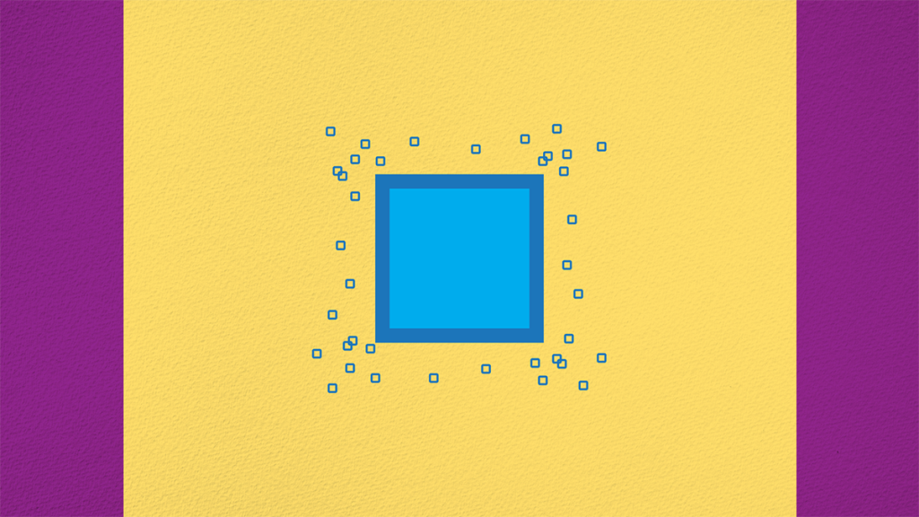
I explored three variations of minimal, simple, imagery. They each have an appeal and would make great animations. However, one stood out as the right feel for Mombi’s brand identity and visual language.
Design Option 1
Design Option 2
Design Option 3
At this stage the project was really taking shape and the excitement was building. I could see clearly how this would animate and how impactful it would be. Even though I had motion planned out and transition ideas built into the storyboard, I allowed for variations once I start animating. You see things in a new way that wasn’t possible until the current stage, and I love that about the creative process, that it’s always changing. I also allow for client feedback and building a partnership that makes a piece great! After sound design in Premiere, this piece was complete.
This project taught me so much, from setting up a bid, to researching ideas in visual metaphors, to the many levels of intense upfront planning that helped the rest of the project go smoothly. These lessons have been used in every project since and continue to be a guide to help projects succeed. Thank you for reading!